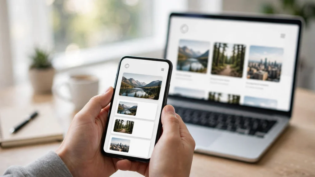
More than 6 out of 10 web visits now happen on a phone. As of 2026, mobile devices account for roughly 62% of global web traffic, and 5.83 billion people — over 70% of the world’s population — browse primarily from a smartphone. If your site doesn’t wo rk beautifully on a small screen, you’re invisible to most of your audience — which is why mobile-friendly website design can no longer be an afterthought.
Google finished its move to mobile-first indexing in July 2024. That means Googlebot Smartphone is the crawler that decides what goes into Google’s index — for every search, on every device. Your mobile pages aren’t a secondary version of your site anymore. They are your site.
This guide covers 9 proven mobile-friendly website design best practices for 2026, from responsive layouts to Core Web Vitals, plus WordPress-specific tips and the tools to test everything.
Why Mobile-Friendly Website Design Decides Your Rankings in 2026
Here’s the chain of consequences most site owners miss:
- Google crawls your mobile version first. If content, structured data, or internal links exist only on desktop, Google may never see them.
- Mobile Core Web Vitals are what count. Google’s ranking systems evaluate the mobile experience; a site that’s fast on desktop but sluggish on a mid-range Android is judged on the Android experience.
- Users punish bad mobile experiences instantly. 53% of mobile visits are abandoned when a page takes longer than 3 seconds to load, and the bounce probability jumps 32% when load time goes from 1 second to 3 seconds.
Only 48% of mobile websites currently pass all three Core Web Vitals. That gap is your opportunity — if your mobile-friendly website design is ahead of the curve.
9 Mobile-Friendly Website Design Best Practices
1. Design Mobile-First, Not Desktop-Down
The old workflow — design for desktop, then squeeze it onto a phone — produces cramped, compromised mobile pages. Flip it: design the mobile layout first, then expand upward.
Mobile-first forces you to prioritize — it’s the essence of mobile-friendly website design. On a 375px-wide screen there’s no room for decorative bloat, so only the essential content, one clear headline, and one primary call-to-action survive. When you scale up to desktop, you add breathing room — you never have to amputate.
In CSS terms, this means writing your base styles for mobile and adding complexity with min-width media queries, not the other way around.
2. Use Truly Responsive Breakpoints
Responsive design isn’t one layout that stretches — it’s a layout that adapts at defined breakpoints. In 2026, cover at minimum: 360–480px (small phones), 481–768px (large phones and small tablets), 769–1024px (tablets and small laptops), 1025px+ (desktops).
Avoid fixed pixel widths on containers. Use fluid grids (fr units, percentages, clamp() for typography) so content flows naturally between breakpoints instead of snapping awkwardly.
If you use Elementor, set your responsive controls per breakpoint rather than relying on the desktop layout to collapse gracefully — it rarely does without help.
3. Serve Flexible, Right-Sized Images
Images are the heaviest resource on the median mobile page — roughly 0.9 MB of a typical 2.6 MB mobile page weight. A 2400px hero image downloaded onto a 390px phone screen is pure waste.
For truly mobile-friendly website design, use srcset and sizes attributes so browsers download the smallest adequate image; serve modern formats (WebP, AVIF) with fallbacks; compress aggressively — aim for hero images under 150 KB; always set explicit width and height attributes to prevent layout shift (a direct CLS killer).
For a deeper dive on image-related speed wins, see my guide on reducing server response time in WordPress: https://amaar.site/reduce-server-response-time-wordpress/
4. Make Touch Targets Big and Forgiving
Fingers are not mouse pointers. Google’s guidance on mobile-friendly website design is clear: interactive elements should be at least 48×48 CSS pixels, with at least 8px of spacing between adjacent targets.
Audit your mobile pages for: tiny text links crammed together in footers; hamburger menus with sub-items too close to tap accurately; form fields and checkboxes sized for desktop cursors; cookie banners whose “reject” button is a 12px afterthought.
Every mis-tap is a frustrated visitor. Every frustrated visitor is a bounce.
5. Simplify Navigation for Small Screens
Desktop mega-menus don’t survive the transition to mobile, so mobile-friendly website design starts with ruthless simplification. Your mobile navigation should: use a clearly labeled hamburger or bottom tab bar (bottom navigation is increasingly standard in 2026); show no more than 5–7 top-level items; keep the search function prominent — mobile users search more and browse less; make the phone number or contact CTA tappable (tel: links) on business sites.
Test your navigation one-handed on a real phone. If your thumb can’t reach the key actions, redesign.
6. Prioritize Speed: Hit the Core Web Vitals Thresholds
On mobile, speed isn’t a nice-to-have — it’s the experience. The thresholds that matter: LCP ≤ 2.5s (how fast the main content appears), INP ≤ 200ms (how quickly the page responds to taps), CLS ≤ 0.1 (how much the layout jumps while loading).
Mobile-specific speed wins: defer or lazy-load below-the-fold content; minimize render-blocking JavaScript — audit plugins ruthlessly; use a CDN — mobile users are often on higher-latency connections; inline critical CSS so first paint doesn’t wait on a stylesheet.
If your INP is struggling, my INP optimization guide walks through the exact plugin audit process: https://amaar.site/improve-inp-wordpress/
7. Keep Typography Readable Without Zooming
Google penalizes pages where users have to pinch-zoom to read. The rules are simple: body text at 16px minimum; line length under ~75 characters; line height of 1.5–1.6 for body copy; sufficient contrast (WCAG AA: 4.5:1 for normal text); never disable user scaling with maximum-scale=1.0 in the viewport meta tag.
Short paragraphs, clear subheadings, and bullet lists aren’t just style choices on mobile — they’re readability requirements for mobile-friendly website design.
8. Eliminate Intrusive Interstitials
Full-screen popups that cover the content the moment a mobile visitor arrives from Google are actively penalized. This includes app-download interstitials blocking the page, newsletter popups with no obvious dismiss option, and cookie walls that prevent scrolling.
If you need popups, use small banners, delay them until after meaningful engagement (30+ seconds or exit intent), and always provide a clear, tappable close button.
9. Maintain Content Parity Between Mobile and Desktop
This is the mobile-first indexing rule that still catches sites in 2026 — and why mobile-friendly website design demands full content parity: whatever your mobile page shows Googlebot is what Google evaluates.
Common parity failures: accordion/tab content collapsed on mobile but visible on desktop; structured data present on desktop but stripped from mobile templates; internal links removed from mobile navigation, orphaning deep pages; images without alt text on mobile versions.
Use Google Search Console’s URL Inspection tool to verify any page: it should say “Crawled as Googlebot Smartphone,” and the rendered screenshot should show your full content.
WordPress-Specific Mobile Tips
- Choose a genuinely responsive theme — test the demo on your phone before committing to a mobile-friendly website design
- Audit your plugins on mobile — page builders, sliders, and chat widgets are the top mobile speed killers; my database optimization guide also helps trim the bloat: https://amaar.site/optimize-wordpress-database-guide/
- Enable mobile caching — if your caching plugin has a separate mobile cache option, turn it on
- Test forms on real devices — Contact Form 7 and similar plugins can render unusably small inputs on phones without CSS adjustments
How to Test Your Mobile-Friendly Website Design
- Google Search Console → Mobile Usability — the authoritative report on what Google sees
- PageSpeed Insights — separate mobile and desktop scores; obsess over the mobile tab
- Chrome DevTools device emulation — good for quick checks, but always validate on a real phone before shipping
- WebPageTest — test on real mobile devices and throttled 4G connections
The Bottom Line
Mobile-friendly website design in 2026 isn’t a checklist you complete once — it’s the default way to build for the web. With mobile carrying the majority of traffic, Google crawling as a smartphone, and users abandoning slow pages in seconds, every design decision should start with the question: how does this feel on a phone?
Get the 9 practices above right, and you’re ahead of the 52% of mobile sites still failing Core Web Vitals. That’s not just better UX — it’s a genuine competitive advantage in search. And once the mobile experience is solid, make sure the rest of your design isn’t working against you — see these 10 web design mistakes to avoid. If your goal is conversions, apply these principles to dedicated landing pages — see my guide to designing landing pages that convert.
Need help making your WordPress site fast and mobile-friendly? Get in touch: https://amaar.site/contact/